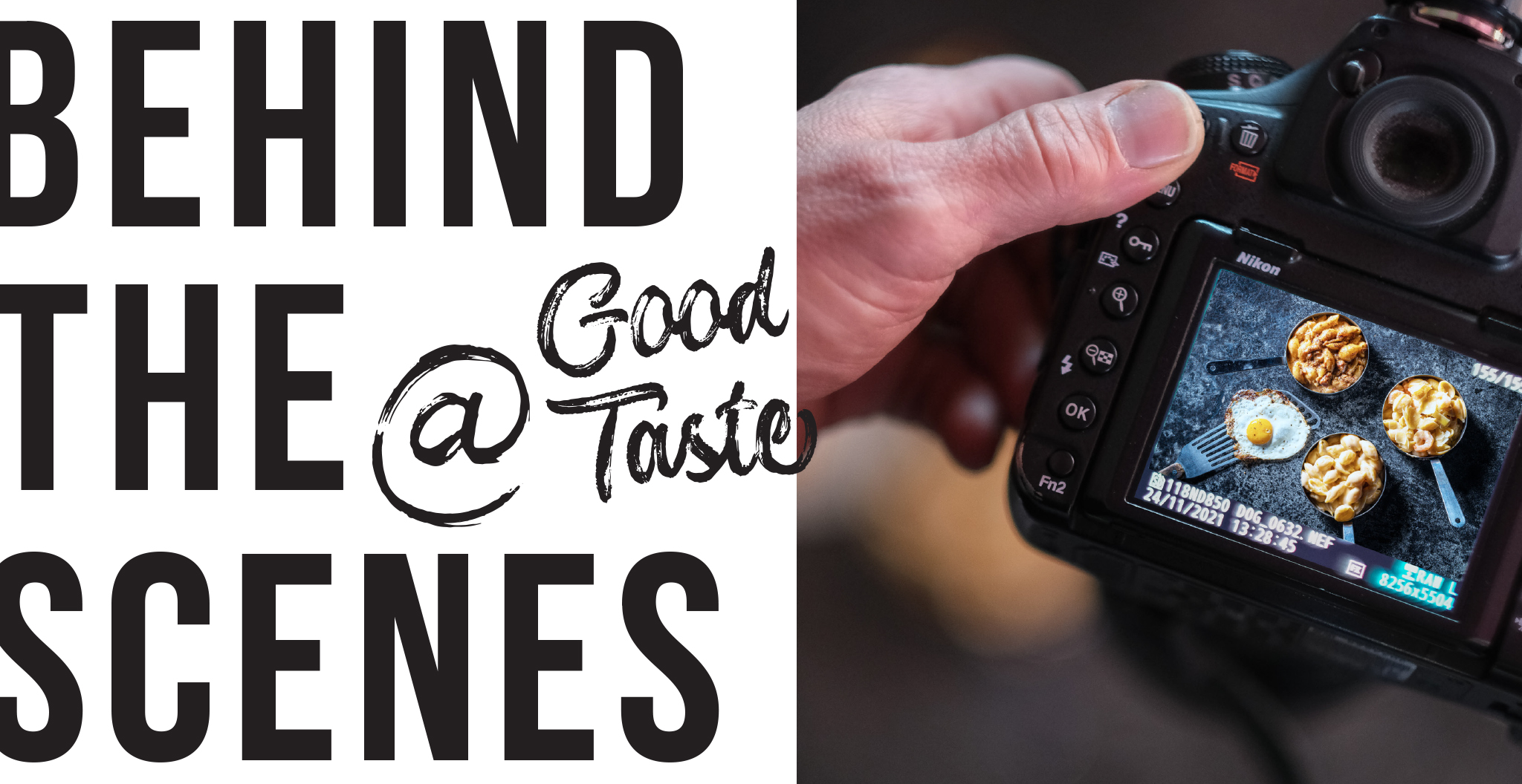
PHOTOGRAPHY BY SCOTT WESTGATE
Striking photography – which draws eyes to the page like a neodymium magnet – reigns as the most glamorous aspect of Good Taste. In reality, for every one-to-two hours spent at a photo shoot, days of labor performed by multiple parties contribute to the execution of this publication: Different specialists handle the scheduling, design, layout, post-production work, and approvals. And that’s in addition to the interviewing, recipe editing, and writing, of course. However, since the photographer cooks up the enticing imagery of this page-turning show, here’s a peek at how that happens.
A food photo shoot often resembles a team of medical professionals crowded around an operating table. An intense atmosphere often prevails as a team of specialists – a food stylist, prop stylist, art director, photographer, and usually a slew of assistants – focus intently on capturing a drool-worthy image of a dish destined for a culinary magazine, advertisement, or billboard. And plenty of tweaking is necessary for this type of palatable portraiture, with the stylist utilizing a hefty kit packed with tweezers, pins, toothpicks, cotton balls, marbles, glue, food coloring, heat guns, and numerous other tools of the trade to ensure a picture-perfect image. Just as super-models require hair and makeup performed by experts, food needs a bit (or a lot) of help to stay looking good for a prolonged period of time – and many appetizing creations are completely inedible. Consider this type of photographic art as a gastronomic trompe l’oiel, though one intended to please the eye rather than deceive the eye.
That said, the point of view embraced by Good Taste photographer Ryan Hulvat aligns more closely with cinéma-vérité, a style of documentary filmmaking that eschews artificiality in order to reveal hidden truths, which he uses both in still shots and in videos with chefs. The particular approach will depend on the specific goal. “We’re trying to show an accurate reflection of what that restaurant looks like and feels like. And even though through lighting and other techniques we can take a really gorgeous photograph, I’m limited by what’s in front of me, what the chef is able to produce, and what materials they have there – food materials, cooking tools, and presentation materials. I don’t bring props – plates or napkins or what-have-you – with me. Yet comments I’ve gotten for years on Good Taste say, ‘Wow, it’s amazing what you’re able to produce. Who’s your food stylist?’ I feel that if I involved another food professional it would not be an honest representation of that restaurant. It would be more about them and their work rather than what the chef is able to do.”
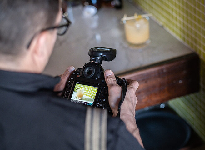
After arriving at the restaurant with several cases of equipment – loaded with an array of lights, stands, reflectors, filters, and other accouterment since being equipped to meet the needs of any situation is critical – Hulvat begins his personal assessment process. “I take a considerable amount of time to walk through the restaurant to get an idea of what the aesthetic is, what the most beautiful surface, plate, background might be. We have to work with what’s there at a real restaurant, with real things,” he says.
Connecting with the chef is another important aspect of a successful shoot, and Hulvat likens a conversation between himself and the chef as a kind of dance. “I’m told I take too much time talking, but I want to hear their stories and know their background. Establishing a relationship makes for a more comfortable photograph. Just like doing a portrait, the more comfortable the subject is with me, the more they can reveal of themselves – and the same thing with food photography,” he explains. “If somebody just throws a dish in front of you, we haven’t talked about what works and what doesn’t work.” For profiles, recipes, and features in this publication, the chef is the food stylist and Hulvat is the food stylist – along with functioning as the photographer.
With his resulting photos, Hulvat tries to not make people think about the lighting. “I’m simulating daylight, thinking about how the eye sees the setting, and trying to represent so many things in a small frame,” he says. “When you walk into a room you see 360° but you can’t do that with photography. And maybe that would be too much information, so you’ve got to just put in the frame those things that are most important.” What the food on a plate looks like – whether particular and finessed or offering a more relaxed family-style presentation – can be informative of the restaurant’s energy.
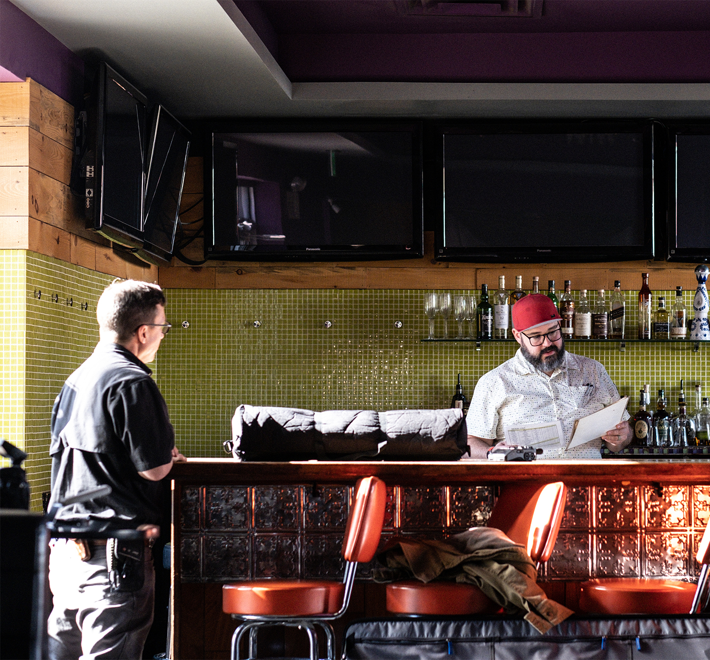
When a shoot for this issue took Hulvat to The Mint Gastropub, an easy-going atmosphere was obvious from the start. The restaurant has appeared in every issue of Good Taste and the rapport between chef and photographer promotes an easygoing exchange about food and the dining process. “Instead of starting from scratch with getting to understand him, it’s more like ‘What have you got to say today?’”
Trust is an important factor when Hulvat is working with a chef: It’s an intimate experience, with the dynamics changing at each destination. And Hulvat always strives to make the shoot as much fun as he possibly can.
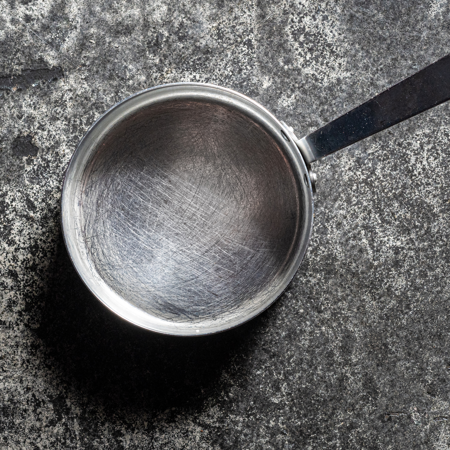
In this case, the chef was delighted when the team decided to shoot the feature entrée on the floor. In truth, the darkly mottled acid-stained and -washed concrete provided a dramatic contrast to the shiny serving pans. The freedom to make such unlikely – and creatively distinctive – choices is just one hallmark of Good Taste’s one-of-a-kind style. (Check out the final shot on the front cover and on page 18!)
Authenticity of Vision
By Scott Westgate, Creative Director
Good Taste exists in order to answer the question: “What should we eat tonight?”
To help the Lehigh Valley with this question, we need to be credible, reliable, and genuine across the board. We lend credibility indirectly through things like production quality, page layout design, font choices, color choices, writing style, subject matter, and our advertiser selection, but perhaps the most obvious and pronounced exhibition of qualitative credibility is through our photography – most often the focal point on any given page.
To be credible and trusted, one must be true to him- or herself. This is no different for any subject in front of a camera lens. With food, we must be true to the chef’s original intentions when creating the dish and be true to each ingredient involved. As a result, when Meris is on site, we do not unnaturally alter, modify, or enhance the appearance of the food. We may rarely suggest mild alterations to plating or reinvigorate a basil leaf with some water, but largely everything captured is as true to what it would look like if you were ordering the dish yourself. Any action we take is meant to enhance what is already there, and not to obscure, hide, or deceive. Everything is shot fresh. And most certainly everything photographed is completely edible (and delicious!).
One of my favorite quotes in the design world is: “Bad design is smoke, while good design is a mirror.” The same is true with our approach to food photography. The decisions we make behind the camera should only help provide clarity. In some ways, the photograph should be “more real” than being there. Cameras are able to capture details and use depth-of-field in a way that the human eye can struggle to achieve (though maybe that depends on your vision!).
Behind the camera, we aim to be as genuine and simple as possible in our approach. We regularly do retail product photography that involves half a dozen oversized lights, a seamless backdrop, and days of post-production work to perfectly capture and present each offering. Food is different. If there is a booth in the corner with some magical natural light coming through a nearby window, let’s shoot there! A drink might look better as it’s being mixed, a steak might look more appealing on the grill, and so on. Although our photography looks incredible, a little bit of imperfection goes a long way in lending authenticity. Maybe we choose not to clean up a drip of sauce on the plate, or perhaps there’s a bite taken out of that sandwich. This hyper-realistic approach leans into the Japanese aesthetic of wabi-sabi, which celebrates the beauty of imperfection.
We also aim to walk away with an authentic sense of the establishment itself, its ambiance and personality. If we were to photograph food at any table that happens to be available – or even less suitably, in a studio – the photography as a whole will convey a very narrow visual representation of the restaurant. After all, when you visit a restaurant, your eyes take in the wall décor, flooring, upholstery, ceilings, servers, textures, lights, etc. Consequently, “scouting” for locations is one of the first things we do upon arrival.
Tabletops are often not the most interesting surface of a restaurant, so for Meris nothing is off limits. We’ve photographed food on bar stools, floor tiles, balcony railings, firewood, outside ponds, gardens, tree stumps, kitchen surfaces, servers’ hands, and have even brought ceiling tiles down to utilize. The more of the restaurant we can capture as part of the food, the better. We’re not photographing McDonald’s where you can get the same hamburger in Bethlehem as you would in Tokyo. The food here is special to this area and special to the individual restaurant. And we focus on making it special to you.
As seen in the Summer/Fall 2022 Issue
Click to Visit Our Advertisers

